Adara
Services
Visual Identity
Client
Retal Urban Development Company
Year
2024
Overview
Adara, a subsidiary of Retal based in Al Khobar, is positioned as a leading provider of comprehensive real estate services and solutions.
With a focus on leasing, sales, and marketing, Adara is dedicated to enhancing the real estate experience for clients and stakeholders. As it expands its offerings to include consultancy and market studies, Adara aims to solidify its role as a trusted partner in the real estate sector.
Adara is focused on engaging property owners, landlords, buyers, tenants, real estate developers, corporate clients, real estate agents, and more. In a strategic move, Adara has partnered with Milk Network to develop a distinctive new visual identity. This collaboration aims to refresh the brand and move away from its previous identity, "Tadbeir," which created confusion due to another company operating under the same name, despite both offering different scopes of real estate solutions.
The decision to adopt the name Adara internally clarifies the brand's identity and provides a fresh, modern, and luxurious approach to the market. This rebranding positions Adara for expansion into the central and western provinces. Milk Network’s objective is to create a visual identity that is simple, timeless, and reflects Adara's core values of integrity, respect, innovation, creativity, client focus, and collaboration. Adara also aims to be the first choice for any luxury brand looking to market in Saudi Arabia.
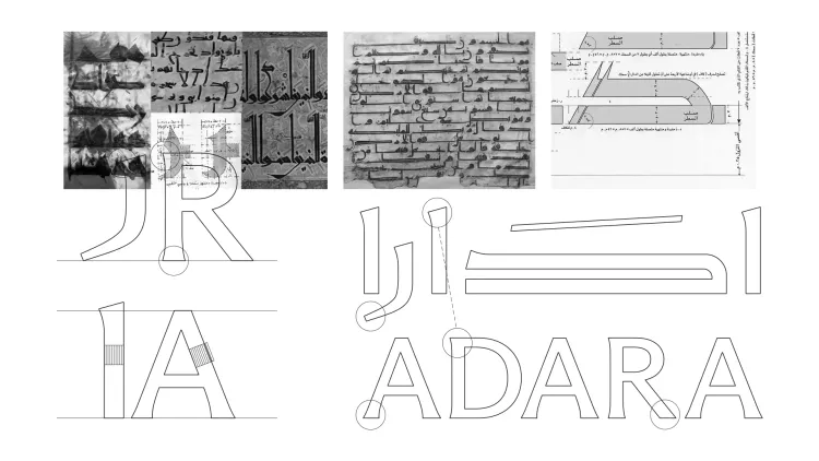
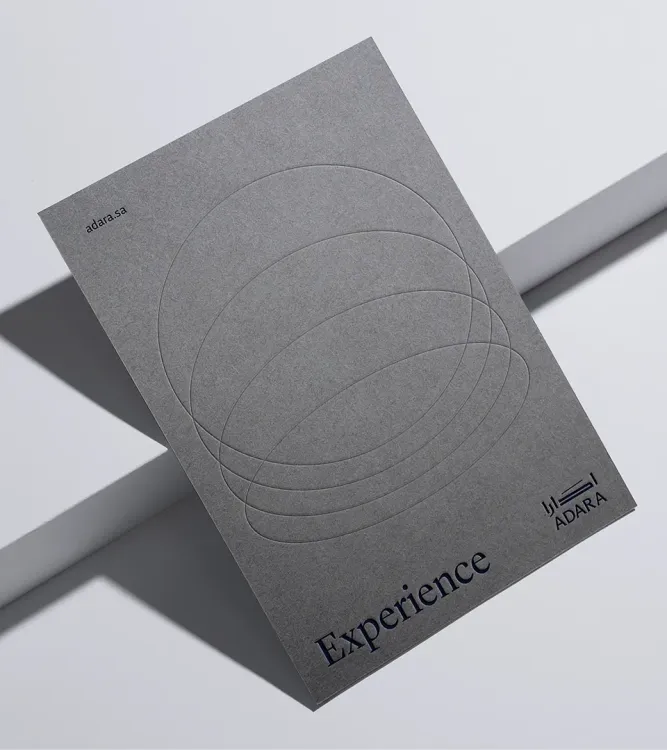
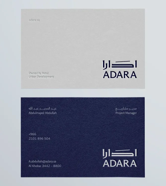
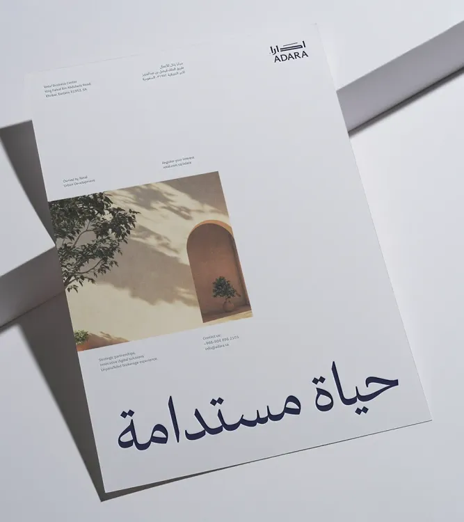
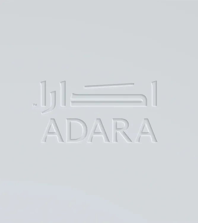
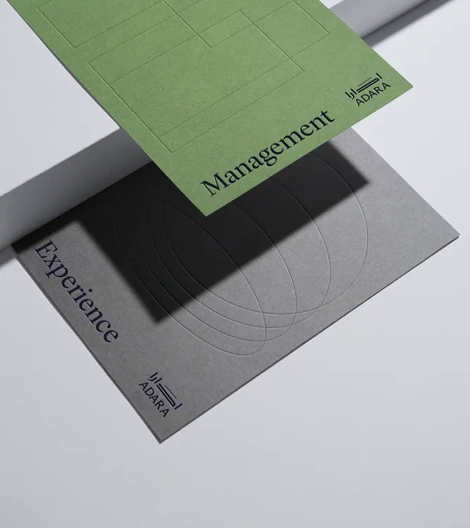
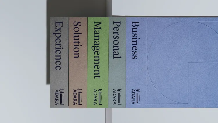
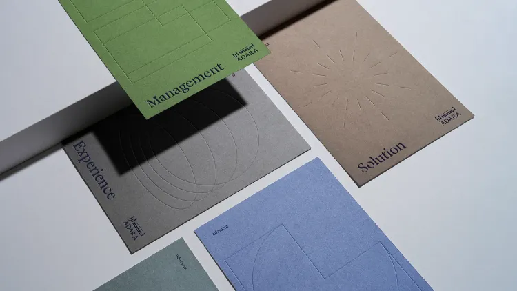
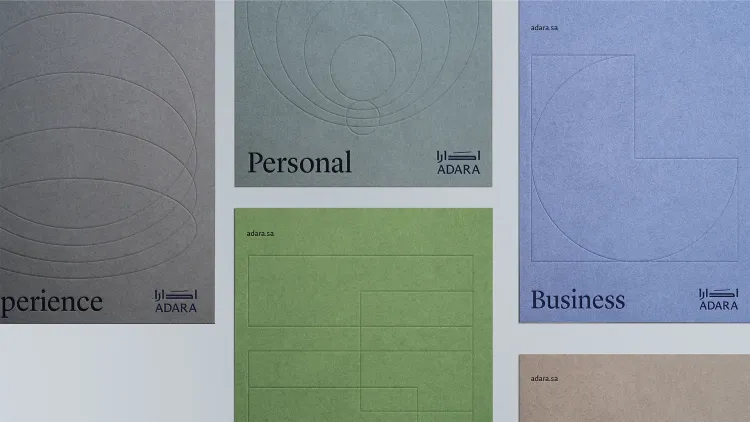
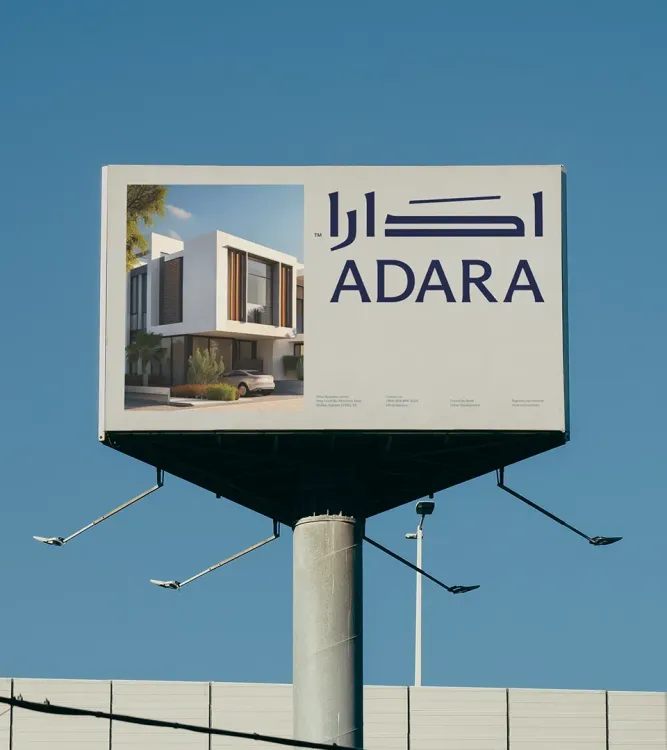
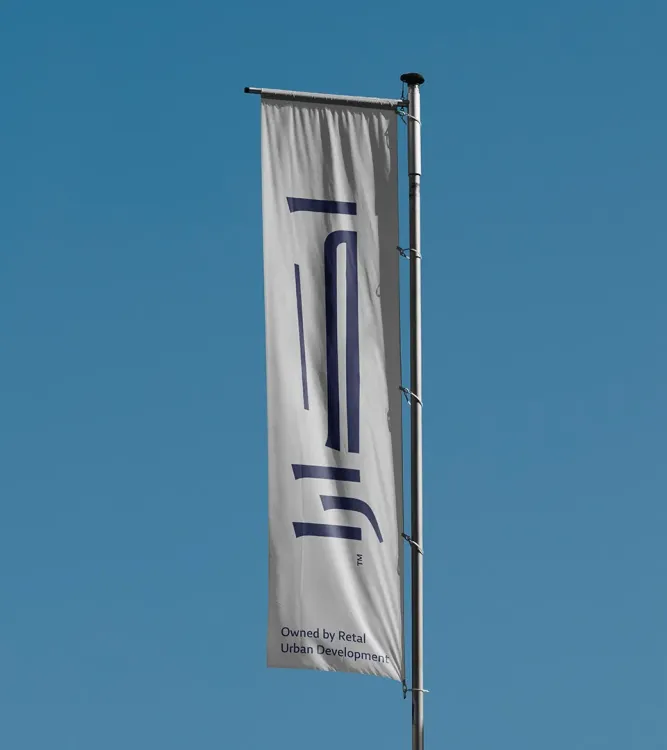
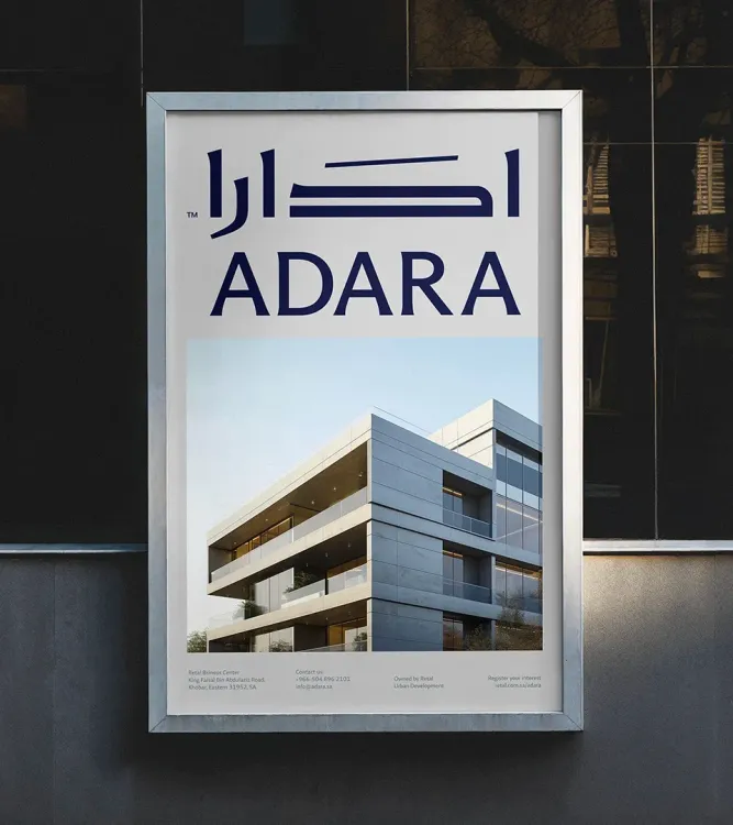
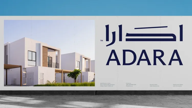
The identity for Adara was crafted with a strong emphasis on typography, particularly the Arabic component, which was designed to embody elegance and modernity. Drawing inspiration from the authentic Kufi font, Milk Network carefully modernized this traditional style by extending and customizing specific letters to reflect Adara's futuristic vision. The resulting Arabic typeface is bold and premium, seamlessly representing the brand's aspirations and cultural heritage. This thoughtful approach to Arabic typography not only enhances visual appeal but also fosters a deeper connection with the local audience. Complementing the Arabic font, the English typeface was created to meet the needs of an international audience. It is simple, modern, and elegant, ensuring high readability.
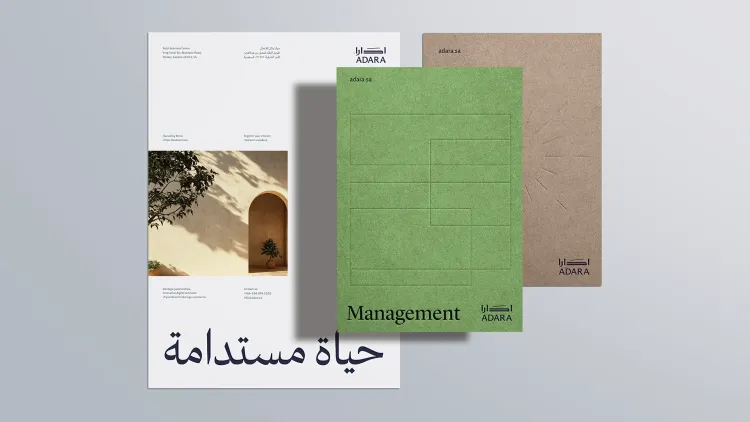
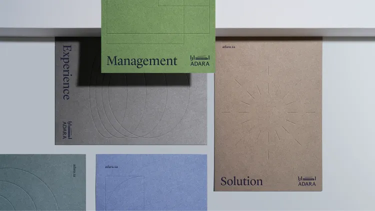
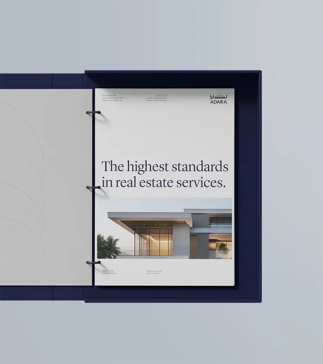
Together, these fonts create a cohesive identity that resonates across diverse audiences. In addition to the typography, the applications, materials, and textures used throughout the branding process were carefully selected to convey a sense of premium luxury. This attention to detail reflects Adara's core values and positions the brand as the top choice for sophisticated clients in the real estate market. By employing high-quality materials and sophisticated design elements, Adara aims to create an exceptional experience that resonates with its target audience.
Conclusion
Adara's brand identity focuses on elegant and modern typography, featuring a bold Arabic typeface inspired by the Kufi font and a highly readable English typeface for international appeal. Together with carefully selected materials, this cohesive design conveys luxury and positions Adara as a top choice in the real estate market, aiming to deliver an exceptional experience for sophisticated clients.
Milk’s Contribution
- Stylescape
- Visual Identity
- Brand Applications
- Brand Guidelines
Every brand has its own unique story, just like human beings. Our aim is to nurture brands and help them grow.

