A Saudi Leading coffee Chain Launched in 1992
Share

Introduction
Milk Network was approached to refresh the brand & revamp its identity in 2019. The brand, which has a long tradition of providing best, authentic coffees at affordable prices, wanted to achieve the following rebranding goals:
- Transforming the brand from coffee-centric to lifestyle-centric
- Liberating the brand from limitations in order to create new sub-brands
- Appealing to the growing young customer base in Saudi
- Modernizing the brand while staying true to the brand roots & legacy
- Expanding the business through franchising
Equity
Perceived as one of the top coffee brands in the Kingdom of Saudi Arabia, the equity of Barn’s is based on serving & selling authentic, premium coffees & snacks, and providing a high level of services. The brand provides a unique customer experience in its well-maintained stores & kiosks that reflect a mixture of local & global culture. With its growing audience & increasing popularity, the brand enjoys a high level of loyalty around the Kingdom of Saudi Arabia. The brand has a great growth potential, both vertically & horizontally, and started to provide good franchise opportunities locally with an outlook for expansions outside the Kingdom.
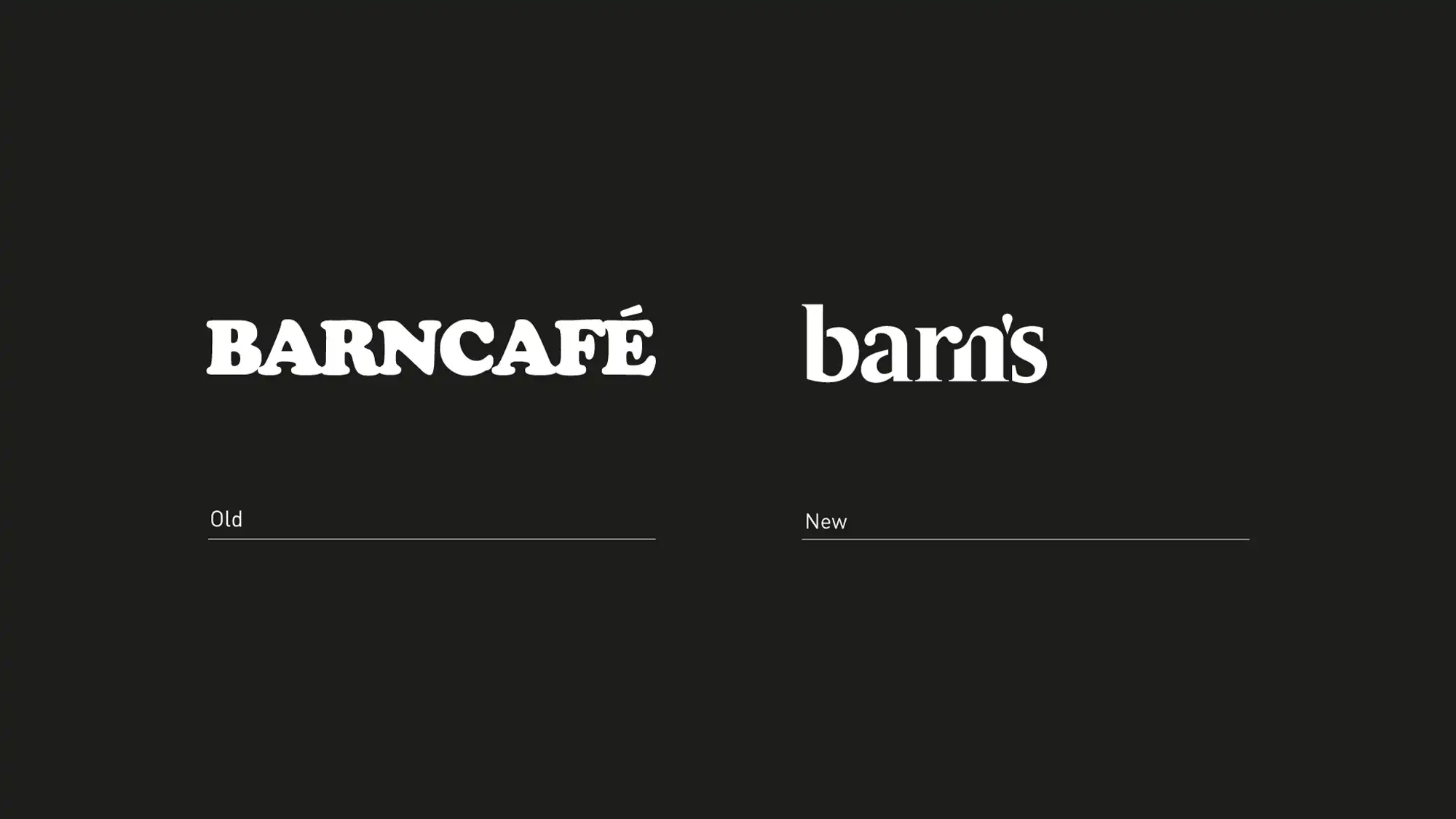
Fresh Logo Features / Logo: Before & After
The new logo reflects the transformation of the brand to make it look younger, simpler, bolder & cleaner, considering that the green color is at the core of the brand’s visual identity (Some competitors use the brand’s hue of green & imitate style to drive more traffic).
Having been in use for 9 years, the old Cooper Black logo looks a bit dated. It looks thick & heavy, restricting the brand within the “café” area.
The logomark got a contemporary upgrade, keeping the same elements (the cup & saucer with a couple of curved lines representing vapor) including the round framing.
The updated wordmark looks slimer, fresher, and more elegant. Both the apostrophe & the letter “s” give a wider perspective for the brand. This is quite clear that removing “café” opens new horizons for more brands to evolve under the mother brand umbrella.
The bilingual logo accommodates both Arabic & English wordmarks without being forced to fit together. Despite the language difference, both the Arabic & English go in complete harmony with each other, both in spirit & nature. Parts of the Arabic look as if they are “sliding down” smoothly to complement the overall look with the English.
Brand Evolution
The brand refresh appeals to the rising young generations in the Kingdom. This is reflected in the brand experience, ecosystem, internal & external wall branding.
A few months ago, Barn’s launched its first sub-brand: Barn’s X. This new sub-brand is specialized in specialty coffee. It looks more premium & a bit lavish.
The brand’s facelifting has paved the way for more sub-brands to evolve & prosper. We might have Barn’s Sweet or Barn’s Coffee Machines!
Photography: Baya Studio
We are the agents of change who pursue to strengthen the creative economy.

We are hiring! Account Manager.

Join the Milk Network Internship Journey

Milk Network Takes the Global Stage: Branding the WTA Finals Riyadh 2024
