The Fast-Traveling Camel
Share
Introduction
Founded in 2016, Nana positioned itself as one of the first online grocery delivery apps in the region. Over the past few years, the company has experienced consistent growth, with expansion in its retail partnerships, product offerings, network of personal shoppers, and customer base.
Due to the pandemic, there was a rapid shift in consumer behavior towards online platforms, leading to increased competition in the industry. Nana had to act swiftly to adjust its brand and business strategy in order to maintain its position as the leading grocery technology company in the region.
Growing out of "Just Groceries"
The company has broadened its range of offerings and services by venturing into other markets and products beyond groceries. These new offerings include home essentials, digital cards, pharmaceuticals, specialty stores, and more.
This rapid growth has forced the brand to grow outside of its shell, resulting in an outdated look and feel that simply didn’t fit quite well in a modern-day market, as well as having an unclear positioning in comparison to the online-grocery sector. Nana has found itself in a safe spot between all the competitors, and so it was time for a major brand refresh.
We joined forced with Nana’s leadership and brand owners, to steer the brand into a modernized and futuristic direction, guided by solid market research to support its new business ambition and align with Saudi Arabia’s progressive direction.
Preserving Brand Equity
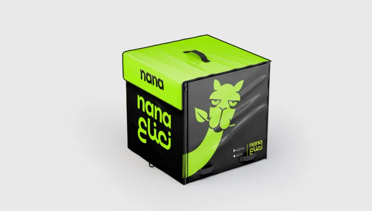
Moving forward while maintaining the existing brand equity was a challenge for the brand, since “Nana” in Arabic literally translated to mint leaves, which has caused a misperception that the business only delivers groceries. To address this, we delved into local insights and decided to introduce a brand mascot that holds deep meaning in the Arab culture to broaden our brand's appeal beyond just groceries and create a stronger connection with our customers by tapping into cultural values.
Introducing "Nana" The Green Camel
The Arabian peninsula has always been linked to trade for thousands of years due to its strategic location, and camel caravans were used to transport goods to different parts of the world. Camels are known for being reliable, a symbol of endurance, resourcefulness, adventure, and tradition. The camel’s ability to withstand harsh conditions and long journeys in the desert makes it a powerful representation of resilience and perseverance, while its adaptability and ability to survive with limited resources aligns it with themes of resourcefulness and flexibility.
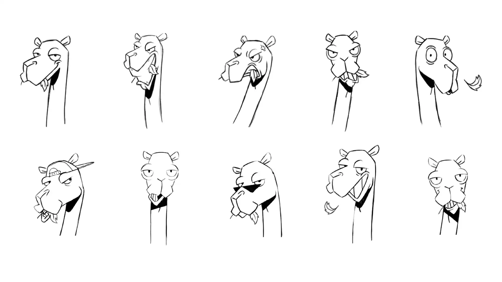
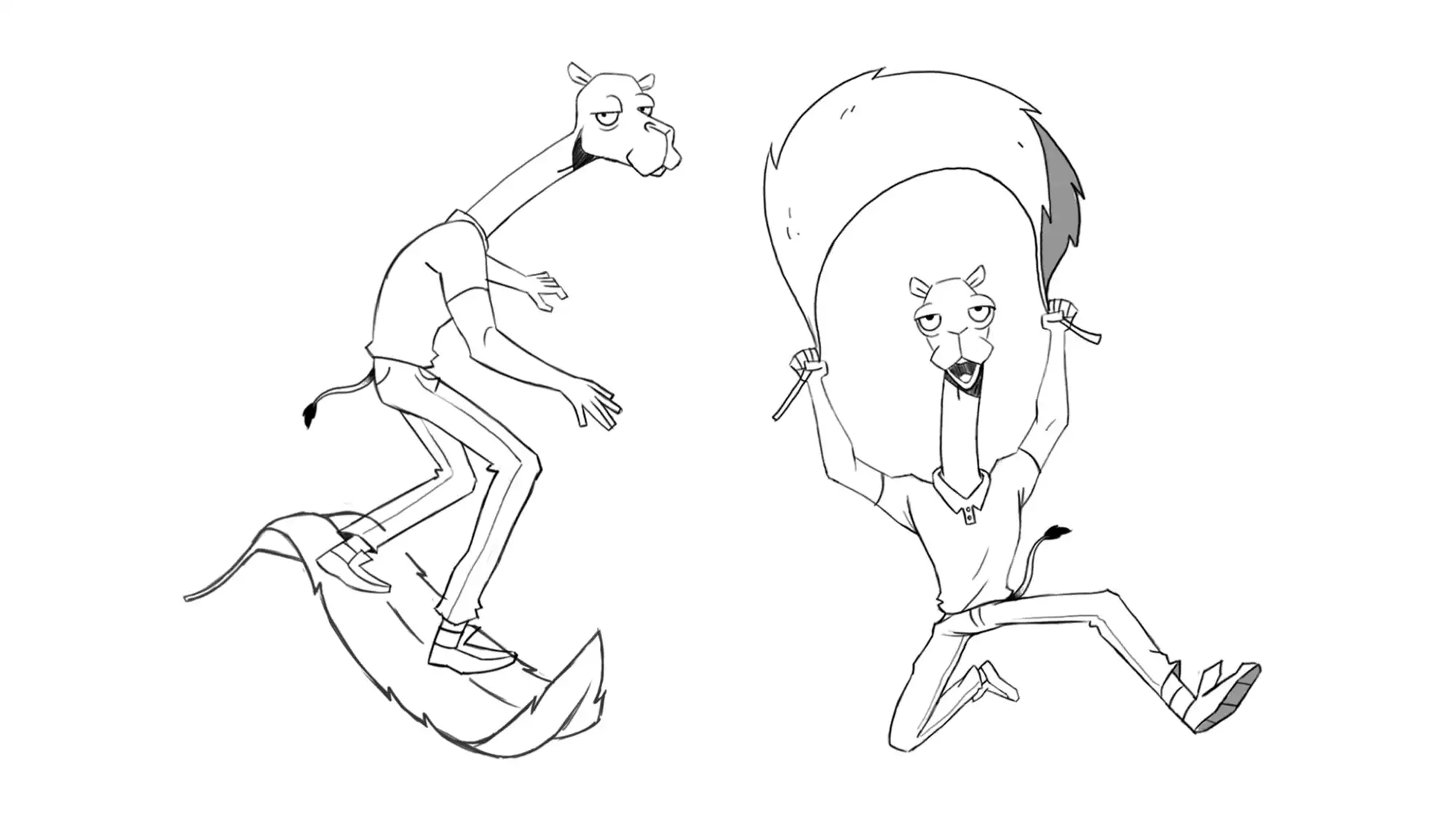
Inspired by that, We have introduced a light-hearted brand mascot characterized by wit and charm to represent our brand and embody our Jester personality.
We gave “Nana, The Camel” a quirky personality that reflects the brand's playful and creative approach to business. For instance, you can spot “Nana” casually chewing mint leaves while delivering groceries. In addition, we gave our character a striking green color and appearance to shock our audience, enhance his memorability, and give him a contemporary and futuristic vibe. This contrast in real life, between the camel’s characteristics and our mascot is opposite to what we know about the animal itself.
Alaa Tameem — Design Director
By doing so, we believe the character will stand out in a crowded market, helping to strengthen brand recognition and recall, as well as create an emotional connection between our character and the audience, supporting our brand essence of being “a daily life companion”.


