Le Croissant
Services
Visual Identity, Re-branding, Packaging
Client
Le Croissant
Year
2021
Overview
Le Croissant Bakery, a beloved local Saudi brand located in Jeddah, and launched in the 1980s. Le Croissant proudly combines the elegance of a French bakery with the charm of a boutique restaurant, offering a delectable array of sweet and savory culinary delights as well as refreshing beverages.
Renowned for their irresistibly fresh and mouthwatering croissants, Le Croissant Bakery ensures that these delightful treats are priced affordably, making them accessible to everyone.
Our partnership with Le Croissant was driven by changes in their ownership structure and expansion goals. To rejuvenate the brand and enhance its visual identity, our client aimed to revitalize its legacy, ensure relevance, and position it as the go-to choice for accessible and satisfying French breakfast options. The target audience included efficient individuals, early birds, and food enthusiasts.
The objective was to create a brand that resonates with the target audience while maintaining the brand's personality. Upholding existing brand equity, retaining customers, and attracting new ones were crucial goals.
The main challenge was the inconsistent identity of the current brand, with branches featuring varying elements of blue and green without clear reason or adherence to brand guidelines. To address this, the objective was to establish a consistent brand identity with clear guidelines, ensuring alignment and consistency across all branches.
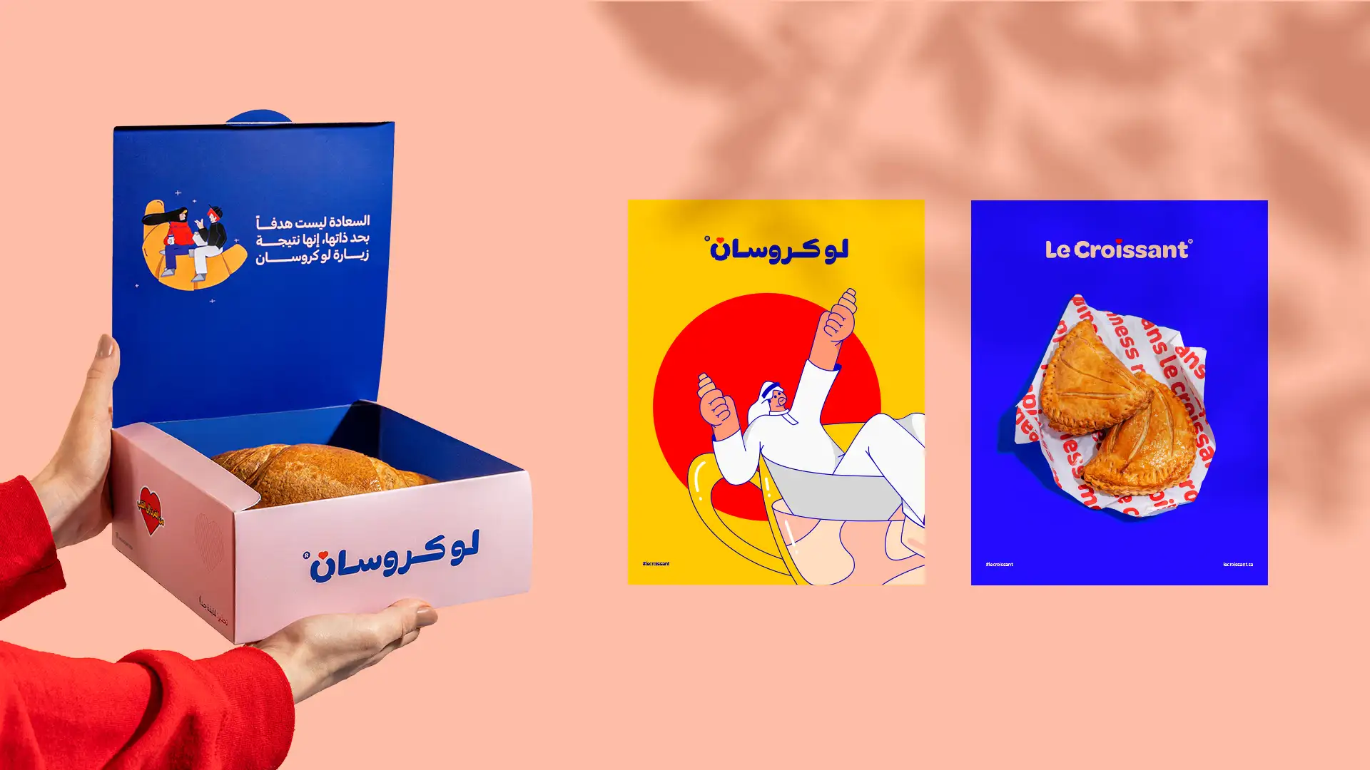
We successfully developed a highly distinctive visual identity that upholds the brand's equity and image while simultaneously updating it and elevating it to new heights.
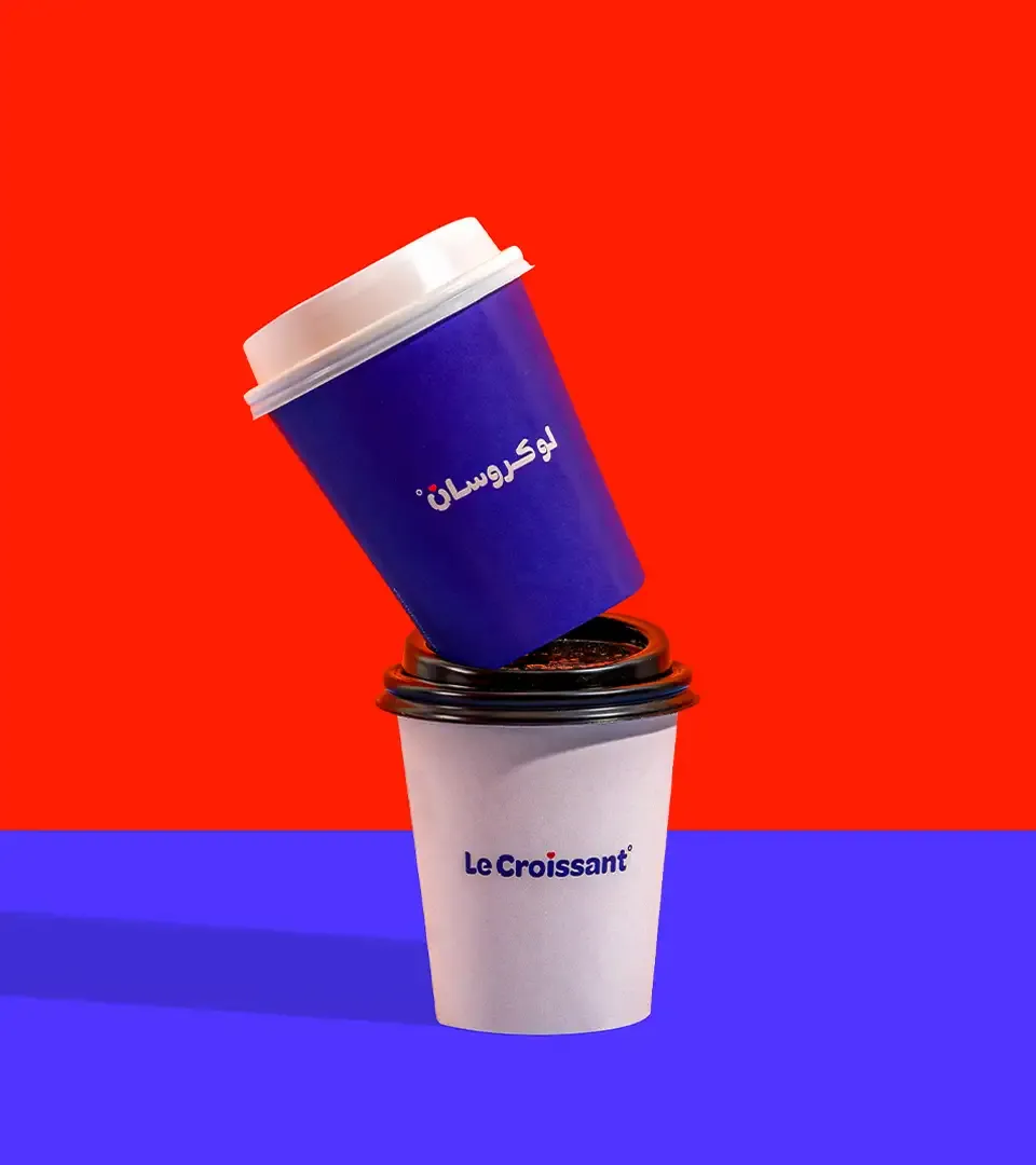
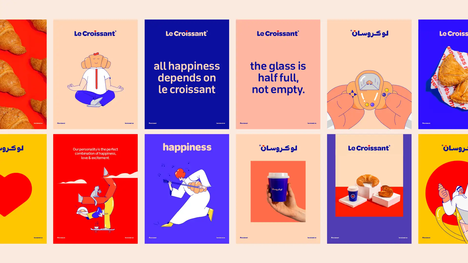
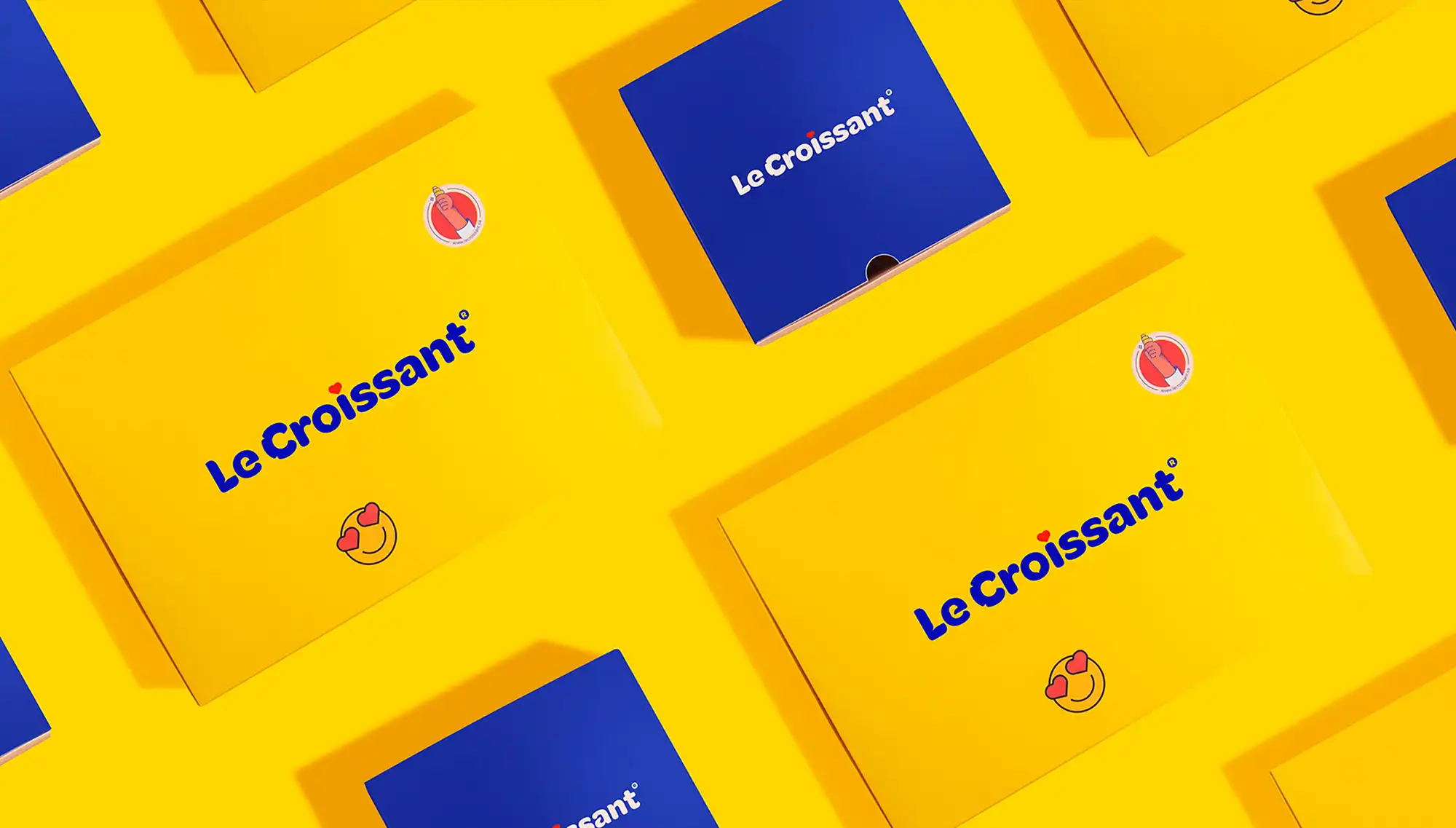
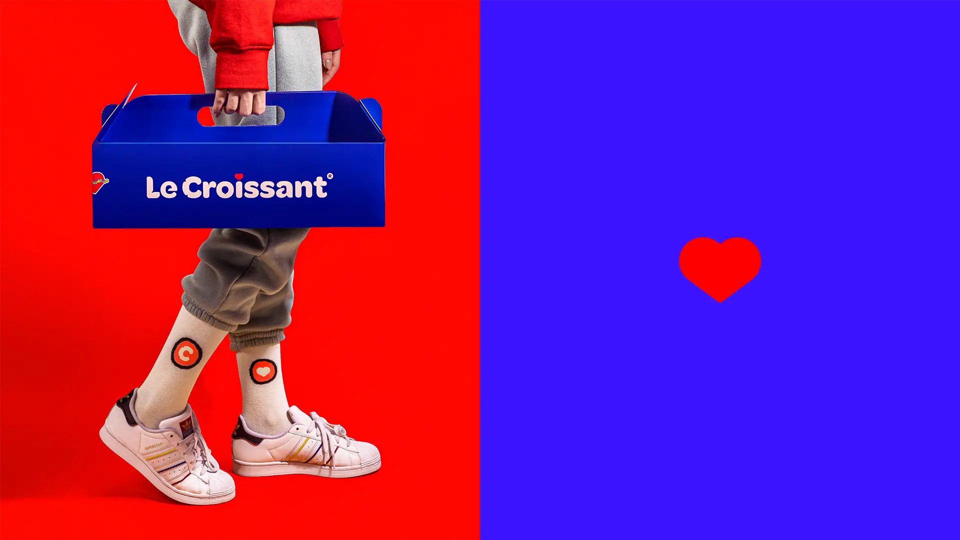
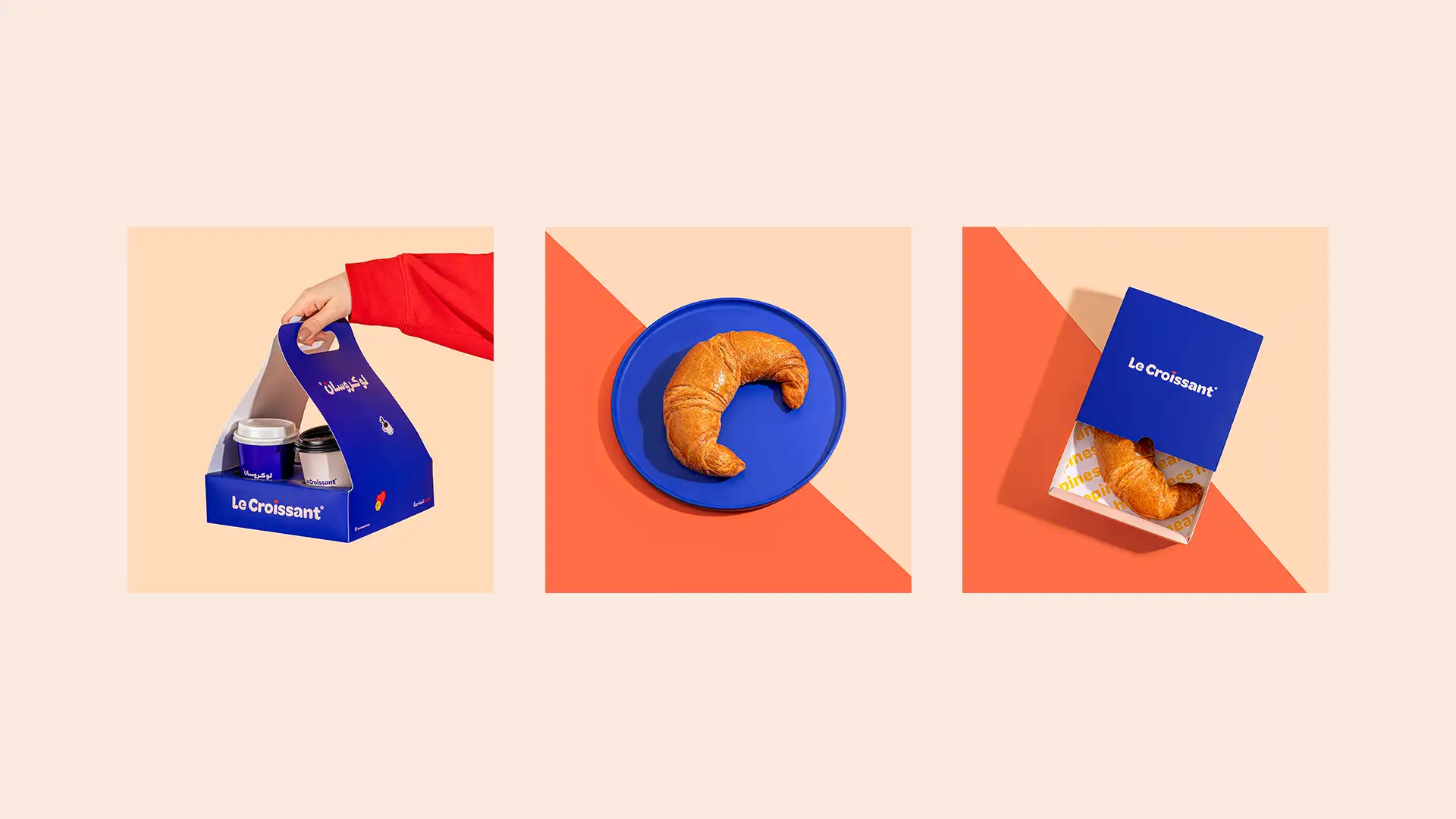
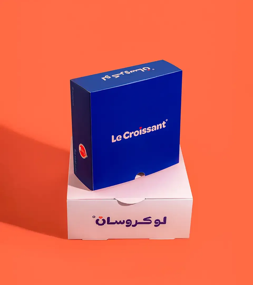
The new logo features a custom typeface with a fluffy aesthetic, which imparts a friendly and modern yet mature and abstract look and feel. We took care to preserve certain original brand elements, such as the dark blue color, which serves as the primary color that sets the brand apart from other bakeries and restaurant boutiques. Additionally, we maintained the consistent shape at the beginning of the word "croissant," serving as both a symbol for the brand and a replacement for the letter "C."
The heart symbol positioned above the letter "I" embodies the brand's primary archetype, "The Innocent," while also allowing us to spread love, optimism, and happiness throughout. This is further complemented by playful illustrations and vibrant colors that perfectly represent the brand's tagline, "Baked with Love."


Milk's Contribution
- Brand Identity
- Strategy
- Packaging