Nphies
Services
Naming, Visual Identity, Branding
Client
Ministry of Health
Year
2020
Overview
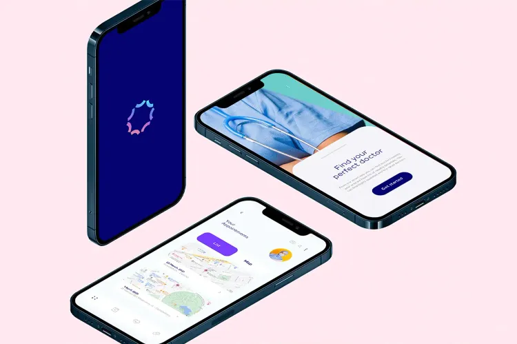
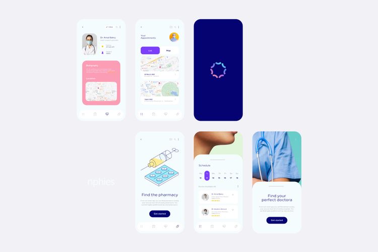
Nphies; a healthcare digital platform under the Council of Health Insurance built to connect all healthcare stakeholders in the Kingdom of Saudi Arabia. The platform offers Insurance services and Clinical services all in one.
Nphies is a pioneering digital platform in the Middle East, connecting health institutions, insurance companies, payment providers, and users. Its mission is to improve healthcare services and drive digital transformation in Saudi Arabia's health insurance sector. With a focus on all citizens and residents, Nphies supports the goals of the health sector transformation program and Saudi Vision 2030.
The project was initiated with an understanding and alignment session involving all stakeholders. It was crucial to establish a connection between the new platform and the values and personality of the Ministry of Health (MoH), and to bridge the gap regarding the Brand Purpose, Positioning, and Personality.
We began with a strategic brand naming process, which resulted in the selection of "Nphies." This name is easy and concise, making it suitable for digital platforms with varying sizes. Additionally, it is linked to the platform's full name, "National Platform for Health & Insurance Exchange Services."
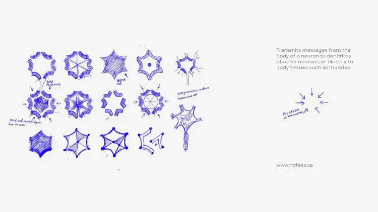
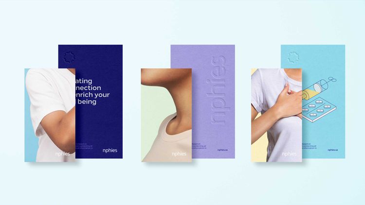
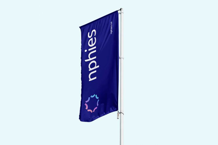
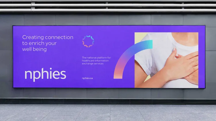
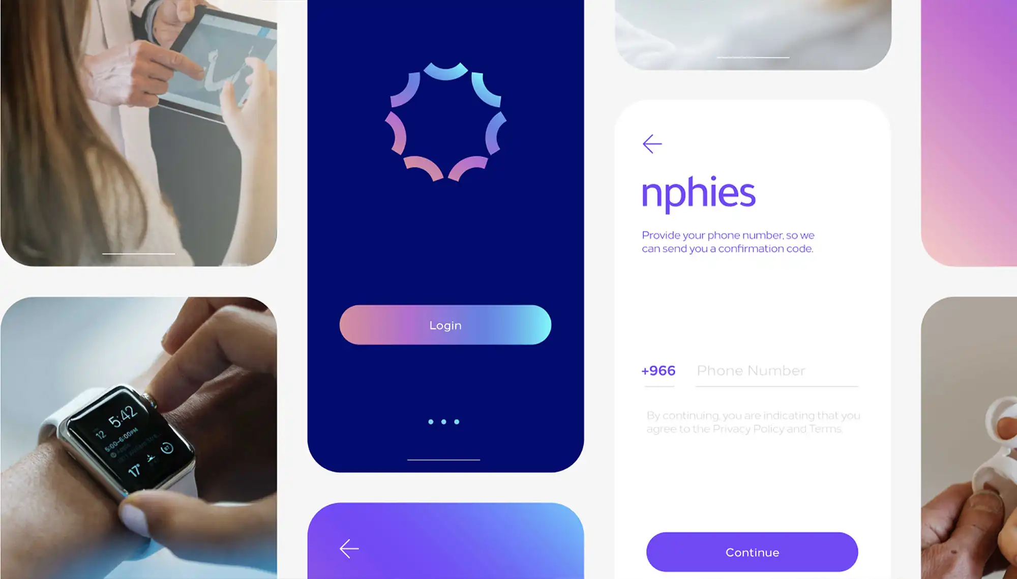
The concept of the brand is inspired by the nervous system, which plays a vital role in connecting different organs and transmitting signals within the body. The logo takes the form of a nerve cell, symbolizing readiness to connect, process, store, and transmit a wide range of information and orders, reflecting the functions of the Nphies platform in creating and maintaining extensive medical databases for all citizens in the Kingdom. To complement the symbol, we also chose a customized modern typeface and an interesting color palette that showcases the brand's futuristic, innovative, and vibrant qualities.
Conclusion
The Nphies brand concept draws inspiration from the nervous system, with a logo resembling a nerve cell that symbolizes its role in connecting and transmitting vital information. Complemented by a modern typeface and vibrant color palette, this identity reflects the platform's futuristic qualities and commitment to processing and sharing extensive medical data for citizens in the Kingdom, enhancing health services and community communication.
Milk's Contribution
- Brand Naming
- Brand Identity
